Website design for logistics companies in India: what to include (with a real example)
What a logistics or warehousing website has to prove, a page structure that works, the mistakes that lose enquiries, and a real example: the RL Logistics website we designed and built.

A logistics company sells reliability, and reliability is hard to show on a screen. The people who visit your site are importers, manufacturers and retailers comparing several providers before they pick up the phone. They are not browsing. They are checking whether you look like a company that will not lose their cargo.
That makes a logistics website different from most business sites. The job is to show control, make the services easy to understand, and make asking for a quote the easiest thing to do.
What logistics buyers look for
- Proof of control: where the cargo is, who is answerable for it, and what happens at the port.
- A clear list of services: warehousing, road transport, air, ocean, customs clearance and last mile, in words a buyer uses.
- How shipments are tracked, and what proof of delivery looks like.
- Who you work with: the industries you serve, so a buyer knows you understand their cargo.
- A named, reachable team: a phone number, an email and the right inbox for quotes, shipment support and escalations.


A page structure that works
- The promise, in one line, on the first screen, with two clear actions: see the services and get a quote.
- Who you are: one operator or a full-service partner, told in a short block.
- The services, in one scannable list, each with a line on what it covers.
- How a shipment is looked after: tracking, handover points and proof of delivery.
- The path from port to warehouse to doorstep, one step at a time.
- Industries served and the kind of cargo you handle.
- A closing quote request with phone and email, and a full enquiry form on the contact page.
Mistakes that lose enquiries
- A brochure in website form: long paragraphs, no clear next step.
- Stock photos of ships and containers that look like every other provider.
- Hiding the quote button, or making it a long form with ten fields.
- No named contact, so the buyer cannot tell who will answer.
- Services listed with no explanation of how they work.
- A heavy page that is slow on a mobile connection in a warehouse or at a port.

A real example: RL Logistics & Warehousing
We designed and built the website for RL Logistics & Warehousing, a Delhi company that offers warehousing, road transport, freight forwarding and customs clearance. The brief was the one above: explain a wide range of services, show how cargo is looked after on the way, and make asking for a quote effortless.
The site tells the story as a journey instead of a brochure. A road timeline runs down the side of the page, and the scenes change from the container yard to the highway to the port as you scroll. It explains six services, how shipments are tracked and how to ask for a quote, all in one scroll. Click through the sections below, or open the live site and scroll it yourself.
Thoda Logic work · RL Logistics & Warehousing
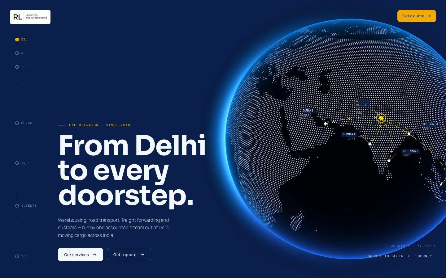
From Delhi to every doorstep
The first screen: a dotted globe linking Delhi to its ports, the promise in one line, and two clear actions.
Designed and built by Thoda Logic. Read the RL Logistics case study →
What we did on the RL site, and why
- Lead with the promise. The first screen says "From Delhi to every doorstep" over a dotted globe that links Delhi to its ports.
- Show, don't list. Each part of the journey has its own scene: the container yard, the road, the port.
- One clear next step. "Get a quote" sits in the header and again at the end, so asking is always one click away.
- Answer the questions first. Services, how shipments are tracked, industries served and contact details are easy to find before anyone has to ask.
- Separate inboxes on the contact page for quotes, shipment support and escalations.
Make it findable too
A good site still has to be found. Give each service its own page over time, keep the wording a buyer would search for, and set up your Google Business Profile. Our SEO basics for small businesses cover the rest, and what a website costs will help you plan the budget.
Quick answers.
A one-line promise, a clear list of services, how shipments are tracked, the industries you serve, a named contact with phone and email, and a quote request that is always one click away.
Show control rather than claiming it: where the cargo is, who is answerable, what happens at the port, and what proof of delivery looks like. Real scenes of your yard, trucks and port beat generic stock photos.
Thoda Logic designed and built it. You can read the case study or scroll the live site on the RL Logistics page.
Yes. Buyers compare several providers, so asking for a quote should be the easiest action on the site. Keep the form short and give a phone number and email next to it.